


Ever wondered why certain product labels just seem to pop out at you on the shelves? It’s not just clever design; it’s color psychology at work.
There’s a lot more to label design than just nice fonts and pretty graphics. It’s about understanding how colors influence emotions and behaviors. This is where color psychology comes into play.
Continue reading as we explore how to use color psychology in label design, providing real-world examples from brands who know exactly how to make it work to their advantage.
What is color psychology?
Color psychology is the study of how colors affect perceptions and behaviors. Different colors can evoke different feelings, making them a powerful tool in your product labels. Here’s a quick rundown of common color associations in label design across industries:
1. Red: Excitement, passion, urgency
Food & beverage: Heinz uses red on its ketchup bottles to stand out on shelves and stimulate appetite, consistent with its classic branding.

Retail: Target’s bold red logo draws attention and creates a sense of urgency for deals and sales.
2. Blue: Trust, calmness, professionalism
Healthcare: Oral-B uses blue to suggest cleanliness and trust in their dental care products.

Finance: Chase Bank uses blue to signify trust and reliability.
3. Green: Health, tranquility, nature
Food & beverage: Starbucks uses green in its branding and packaging, aligning with their commitment to sustainability and high-quality ingredients.

Health & wellness: Nature Valley uses green in their packaging to emphasize natural ingredients.
4. Yellow: Happiness, warmth, caution
Home improvement: Stanley tools use yellow for visibility and to signal caution.

Food & beverage: McDonald’s uses yellow in its label packaging to create a welcoming and happy atmosphere.
5. Orange: Energy, enthusiasm, creativity
Retail: Scrub Daddy uses orange in its branding to convey energy and enthusiasm, reflecting the product’s innovative and practical cleaning solutions.

Food & beverage: Fanta uses orange to evoke fun and energy, aligning with its fruity flavors.
6. Purple: Luxury, wisdom, sophistication
Food & beverage: Cadbury’s chocolate packaging uses purple to convey luxury and indulgence.

Alcoholic beverage: Crown Royal is a Canadian whisky brand is known for its distinctive purple bag and label, aligning with the brand’s premium image.
7. Black: Elegance, power, mystery
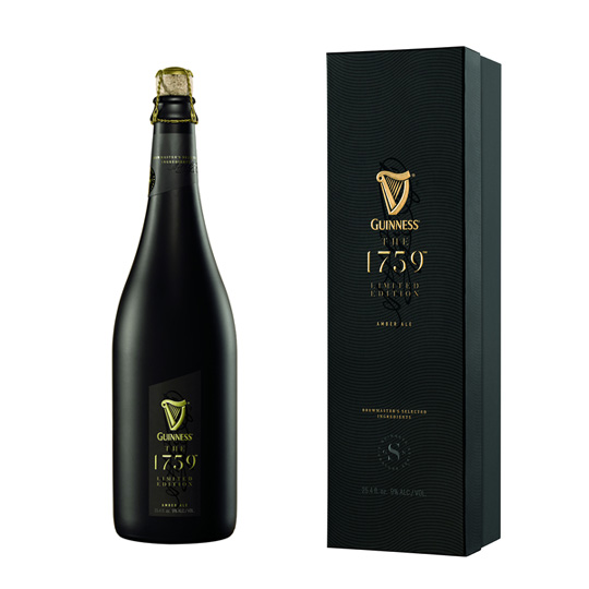
Food & beverage: Guinness uses black in its iconic beer packaging to evoke richness, depth, and the historic strength of the brand.

Technology: Apple’s black packaging for products like the iPhone suggests sleekness and high-tech quality.
8. White: Purity, simplicity, cleanliness
Skincare: Olaplex uses white packaging for its haircare products to emphasize purity and high-quality ingredients, reinforcing a sense of simplicity and effectiveness.

Healthcare: Cetaphil utilizes white in its packaging to highlight the cleanliness and gentle nature of its skincare products, appealing to those seeking hypoallergenic and non-irritating options.
Color psychology is essentially the idea that colors can influence our mood, feelings, and even behaviors. For instance, have you ever noticed feeling more relaxed in a room painted blue or more energized in a bright red environment? That's color psychology!
Aligning color psychology with brand identity
Before choosing colors for your label, consider your brand identity and the message you want to convey. Consistency in color usage helps reinforce your brand image. For example:
- Coca-Cola: The iconic red label is instantly recognizable and evokes feelings of excitement and energy, aligning with the brand’s lively and youthful image.
- Tiffany & Co.: The distinctive robin egg blue color, known as “Tiffany Blue,” conveys luxury, elegance, and exclusivity, perfectly matching the high-end jewelry brand.
In a nutshell, your brand colors should be in harmony with your overall brand identity. It's like having a well-coordinated outfit—everything just fits together seamlessly.
Targeting your audience
Understanding your target audience is crucial in selecting the right colors. Different demographics can have varying reactions to colors. For instance:
- Kids: Bright, vibrant colors like red, yellow, and blue are appealing to children. Brands like Crayola use these colors to attract young customers.

- Health-conscious consumers: Brands targeting health-conscious individuals often use green to symbolize health and nature. Whole Foods and Naked Juice are prime examples.
Creating emotional connections
Colors can create emotional connections, making your product more memorable. Here are some ways to use colors to evoke specific emotions:
- Energy and excitement: Red and orange are high-energy colors. Red Bull uses a bold red and blue color scheme to convey energy and excitement, fitting for an energy drink.

- Trust and reliability: Blue is often used in industries where trust is crucial, such as banking. Chase Bank and PayPal use blue in their logos and labels to convey trustworthiness.
By tapping into the psychology of color, you can create a deeper emotional bond with your customers.
Highlighting key information
Colors can also be used to highlight key information on your label, drawing attention to important details. For example:
- Warnings and instructions: Yellow is often used for caution and to highlight warnings. Many cleaning product labels, like Lysol, use yellow to draw attention to safety instructions.
- Special offers and promotions: Bright colors like red or yellow can make promotional stickers stand out, attracting consumers' attention quickly.

Artwork Flow’s free color finder tool also makes it easy to extract colors from packaging designs, making it easy to find any color in a creative.
How the psychology of colors plays into successful label designs
Here are examples of well-known brands that have changed their packaging designs over the years based on color psychology:
1. Nike
Original design: Nike’s packaging and product designs traditionally featured a sleek, minimalist style with the iconic Swoosh logo in black and white.
Recent change: In 2023, Nike introduced limited-edition packaging designs for special collections, featuring bold colors and artistic graphics to reflect the unique themes of the collections.

Reason for change: The special packaging designs were created to celebrate the unique aspects of each collection and connect with consumers on a more personal level. The vibrant colors and graphics are meant to generate excitement and exclusivity.
Impact: The limited-edition packaging has generated buzz and increased brand engagement, helping Nike attract collectors and enthusiasts while reinforcing its reputation for innovation and style.
2. Tropicana
Original design: Tropicana’s packaging used a familiar orange color and imagery of oranges to emphasize freshness and natural ingredients.
Change: In 2009, Tropicana underwent a major redesign that featured a minimalist approach with a predominately white and green color scheme and a more modern font.

Reason for change: The redesign aimed to modernize the brand and make it stand out on crowded supermarket shelves. However, the shift to a more minimalist design was intended to convey purity and simplicity.
Impact: The change faced backlash from consumers who found the new packaging confusing and less recognizable. As a result, Tropicana reverted to its previous design within a few months, demonstrating the importance of balancing modern aesthetics with brand recognition and consumer expectations.
3. Coca-Cola
Original design: Coca-Cola has traditionally used a red and white color scheme, which is associated with excitement, passion, and urgency.
Change: In 2011, Coca-Cola introduced limited-edition packaging with a “Share a Coke” campaign, featuring names and personal messages in a dynamic, playful font.

Reason for change: The goal was to create a more personal connection with consumers and boost engagement by using names and messages that evoked happiness and warmth. The red background remained consistent to maintain brand recognition.
Impact: The campaign was highly successful, leading to increased sales and consumer engagement. The use of personalized names helped Coca-Cola connect emotionally with a wide audience, demonstrating the power of personalized color and text in branding.
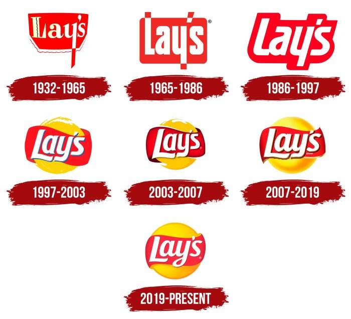
4. Lay’s
Original design: Lay’s potato chips packaging traditionally featured a bright yellow color and simple design, emphasizing a classic, recognizable look.
Recent change: In 2022, Lay’s introduced a redesign with a more contemporary and vibrant color palette, including various bold colors for different flavors, and a modernized logo.

Reason for change: The update aimed to differentiate between flavors more effectively and appeal to a younger audience. The bold colors are designed to create a stronger visual impact and enhance the overall shopping experience.
Impact: The redesign has made it easier for consumers to identify different flavors quickly and has refreshed Lay’s image, making it more appealing in a crowded snack market.
5. Starbucks
Original design: Starbucks originally used a green and white color scheme with a siren logo, symbolizing freshness and a connection to the sea.
Recent change: In 2021, Starbucks redesigned its packaging to include vibrant, eye-catching colors and playful designs. The new packaging features more diverse, colorful designs and a simplified logo.

Reason for change: The redesign aimed to appeal to a younger, more diverse audience and emphasize sustainability. The vibrant colors are used to create a more engaging and fun experience, aligning with a trend towards personalization and inclusivity.
Impact: The updated packaging has helped Starbucks stay relevant in a competitive market and attract a broader customer base. The new design enhances shelf appeal and aligns with the brand’s focus on sustainability and inclusivity.
Tips for implementing color psychology in your labels
Here are some practical tips for using color psychology in your label designs:
- Start with your brand’s core values: Identify what your brand stands for and choose colors that reflect those values.
- Consider cultural differences: Colors can have different meanings in different cultures. Research your target market to ensure your color choices are appropriate.
- Use color contrast: Make important information stand out by using contrasting colors. This helps to draw the eye to key details on the label.
- Test your designs: Conduct surveys or focus groups to gather feedback on your color choices. This can help you understand how your target audience perceives your labels.
Testing and refining your label design
Finally, it’s important to test your label design before finalizing it. Gather feedback from your target audience to see how they perceive the colors and overall design. Make adjustments as needed to ensure your label effectively communicates your brand’s message.
Wrapping up
Using color psychology in label design is a powerful way to connect with your audience, convey your brand message, and make your product stand out. By understanding the emotional and psychological impact of colors, you can create labels that not only attract attention but also foster a deeper connection with consumers. So next time you’re designing a label, remember: it’s not just about looking good, it’s about feeling right too.
Color psychology isn't just a design trend—it's a science-backed approach that can significantly impact your brand's success. So, the next time you ask yourself, "What is color psychology?" think of it as your secret weapon in creating compelling and effective label designs.


.jpg)
.jpg)


